
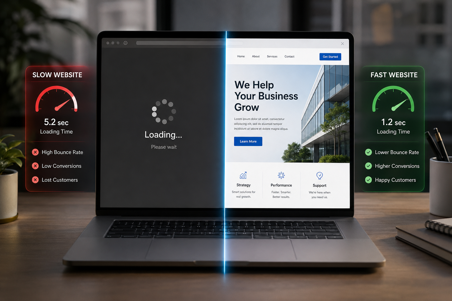
Why Your Website Feels Slow — and What It's Quietly Costing You
Imagine a customer hears about your business, taps your link, and waits. The screen is blank for two seconds. Then it half-loads, the layout jumps as an image drops in, and the button they were about to tap moves. By the time the page settles, they've already hit back and opened your competitor.
You never saw that visitor. You never got the enquiry. And nothing in your analytics will clearly tell you why. This is the quiet cost of a slow, awkward website — and it's one of the most fixable problems in any business's online presence.
Speed and design are the same problem
People often treat "make it faster" and "make it look better" as two separate jobs. They're not. To a visitor, a site that loads instantly and a site that's easy to use feel like the same thing: it just works. A beautiful design that takes five seconds to appear isn't beautiful yet — it's a blank screen. And a fast site that buries the one button people came to press isn't fast in any way that matters.
What actually makes a site feel slow
A few culprits cause most of the pain:
Huge, unoptimised images. A single photo exported straight from a camera or a designer's tool can be several megabytes — larger than the entire rest of the page. Properly sized and compressed, it can look identical at a fraction of the weight.
Loading everything at once. Many sites download every image, script, and font the moment you arrive, even the parts far down the page you may never scroll to. Loading things only as they're needed makes the first view appear far sooner.
Layout that jumps around. When text appears first and images push it down a moment later, people lose their place and mis-tap. Reserving space for each element up front keeps the page calm and stable as it loads.
Too much going on. Heavy animations, auto-playing video, and a dozen third-party widgets each add weight and delay. Every one of them should earn its place.
Why this matters more than it seems
Speed and clarity aren't vanity metrics. Faster sites keep more visitors, rank higher on Google, and convert more of those visitors into enquiries and sales. The effect compounds on mobile, where most of your traffic now comes from and where connections are slower and patience is shorter. A site that feels effortless on a mid-range phone on a normal connection is a genuine competitive advantage.
Good design is invisible
The best websites don't make people think. The next step is always obvious, the important button is easy to find and easy to tap, the text is comfortable to read, and the whole thing responds the instant you interact with it. That sense of "this is easy" is not an accident — it's the result of deliberate choices about layout, hierarchy, spacing, and what to leave out.
How we approach it
When we build a site at HelloZEE, performance and user experience aren't a final polishing step — they shape the decisions from the start. We optimise images and code so pages appear fast, design layouts that stay stable as they load, and lay out each screen around the one action we want the visitor to take. For sites that already exist, we run a performance and UX review that pinpoints exactly what's slowing things down and what's getting in your customers' way, in priority order.
If your website feels slower or more cluttered than it should — or if visitors arrive but rarely get in touch — that's usually a sign there's easy ground to gain. We're happy to take a look and tell you straight.
Visitors decide whether to trust your site in the first few seconds — long before they read a single word about what you do.

0 Comments
Leave a Reply
Your email address will not be published. Required fields are marked *